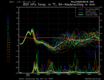

Upper set of lines is forecast temperature (degrees C - left axis) according to different runs of the models (each line a different run). The bold white line is the average of all the model runs, the bold red line is the historical (30 year) average.
Lower set of lines is forecast precipitation (snow cm - right axis).
So where the upper lines dip below zero and the lower lines rise... that's when the snow will come.